Friday, March 6, 2015

Top Public Universities: TEAM K

Tableau Dashboard for this week shows the top universities across the globe.
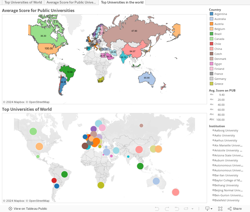
The first chart  ranks the Countries based on the University Score they have received.


Thursday, March 5, 2015

Urban Expansion in east Asia, 2000-2010 - Team J


World Bank East Asia and Pacific Urban Flagship Study on Measuring Urban Expansion 2000-2010. The attached overview tables were produced as part of the World Bank study on measuring urban expansion across the East Asia region between c2000 and c2010.

SAT Comparisons 1990 vs 2004 (Team F)

The SAT was first introduced in 1926 and since then it has been a way for Universities all around the United States to measure potential students intellect. Since 1926 the basic way of taking the SAT, the participation of it, and the average scores for its various parts have all changed over time. The graphs below show a couple of different things. First, the geographical graphs shows the participation rate of the SAT in 2004 and in 1990. Secondly the other graphs compare average scores on the Math portion and the verbal portion of the exam taken in 1990 to the portion in 2004.

Blood Alcohol Content (Team E)

The data contains traffic accidents for each state categorized by Blood Alcohol Content (BAC) into three groups: 0.00 BAC (Sober), 0.01 - 0.07 BAC (Buzzed), 0.08 or more BAC (Drunk). The visualizations show each category on the map where the darker color represents the higher percentage of total accidents and there is a scatterplot to show the positive correlation between % 
of buzzed accidents and % of drunk accidents for each state. 


Wednesday, March 4, 2015

Movies' Profit--Team H

Watching Movies is one the entertainment. Therefore, we are interested in whether the genre of the movie has anything to do with there profit. Also, whether the Profit in US are different from worldwide profit.

Thursday, February 26, 2015

How many marriages are successful?

This gives a relativity between the population, number of marriages and the divorce rates. This is just a depiction to show how many marriages are successful. It is interesting to note that the rates are not very encouraging with some of the states showing more than 83% failure rates based on the number of marriages and divorces in a year.

The highest failure rate is in Maine and the lowest rates are in North Dakota. We would like to predict how this numbers would look like in 10 years from now.